

Essential Guide to IELTS Writing Task 1
Interpreting visual data and accurately summarizing information is a vital skill for higher education and global communication, which is assessed in the IELTS Writing Task 1 exam. This makes it a crucial element of both the Academic and General Training modules.
Understanding IELTS Writing Task 1
Task 1 of IELTS Writing evaluates a candidate's ability to interpret and present information clearly and coherently. It requires candidates to describe visual information or write a letter in a minimum of 150 words within 20 minutes. The key skills assessed in Task 1 include:
- Interpreting Visual Data or Prompts:Candidates must accurately analyze the provided visual data or letter prompts, effectively conveying the main trends, comparisons, and significant details.
- Organizational Skills:It is crucial to structure the response well, which includes introducing the topic, offering an overview or purpose, and presenting key details in a logical manner.
- Language Accuracy:Candidates are assessed on their ability to utilize a variety of vocabulary, grammatical structures, and cohesive devices to express ideas clearly and precisely.
IELTS Writing Task 1: Question Types
It's important to note that Task 1 varies between IELTS General and Academic formats. Below are the different types of questions for each of these IELTS exam types.
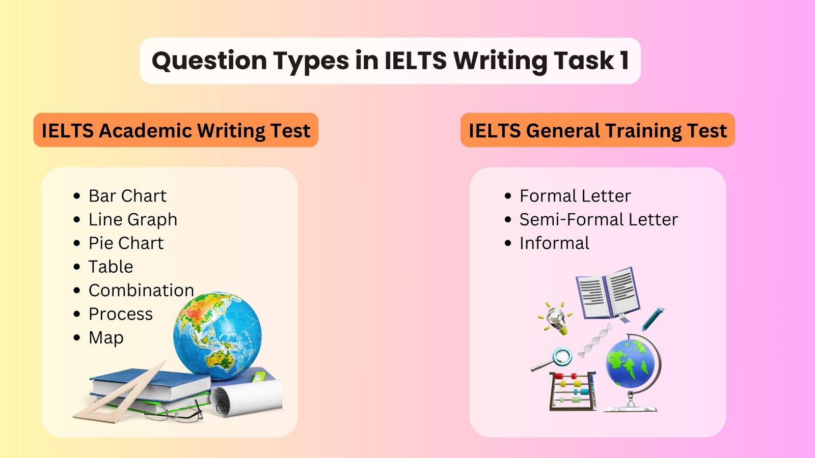
IELTS Academic Writing Task 1
In IELTS Academic Writing Task 1, you will need to present data related to an academic context, displayed in one or more figures, such as graphs, charts, tables, diagrams, or processes. Typically, there are seven types of questions in this task.
- IELTS Table chart
- IELTS Bar chart
- IELTS Line graph
- IELTS Pie chart
- IELTS Map Diagram
- IELTS Process diagram
- Combination (Mixed) charts
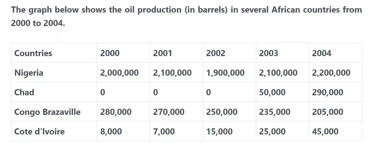
Table Chart Sample
The graph below shows the oil production (in barrels) in several African countries from 2000 to 2004. Summarise the information by selecting and reporting the main features, and make comparisons where relevant. Write at least 150 words.
Sample Answer
The table presents a comparison of oil production in four African countries—Nigeria, Chad, Congo Brazzaville, and Cote d'Ivoire—over the period from 2000 to 2004.
Overall, Nigeria consistently recorded the highest oil production each year. Meanwhile, oil production rose in both Chad and Cote d'Ivoire, whereas it declined in Congo Brazzaville and fluctuated in Nigeria.
Chad had no oil production between 2000 and 2002. In 2003, the country produced around 50,000 barrels, and this figure surged to 290,000 barrels by 2004. Similarly, oil production in Cote d'Ivoire increased steadily from 8,000 barrels in 2000 to 45,000 barrels in 2004. In contrast, Congo Brazzaville experienced a continuous decline in oil production. Starting at 280,000 barrels in 2000, production dropped by 10,000 to 20,000 barrels annually, reaching 205,000 barrels by 2004.
In Nigeria, oil production showed fluctuations. In 2000, the country produced 2,000,000 barrels, which rose slightly to 2,100,000 barrels in 2001. However, production dipped by 200,000 barrels in 2002. From that point on, production increased steadily, culminating in 2,200,000 barrels by 2004.
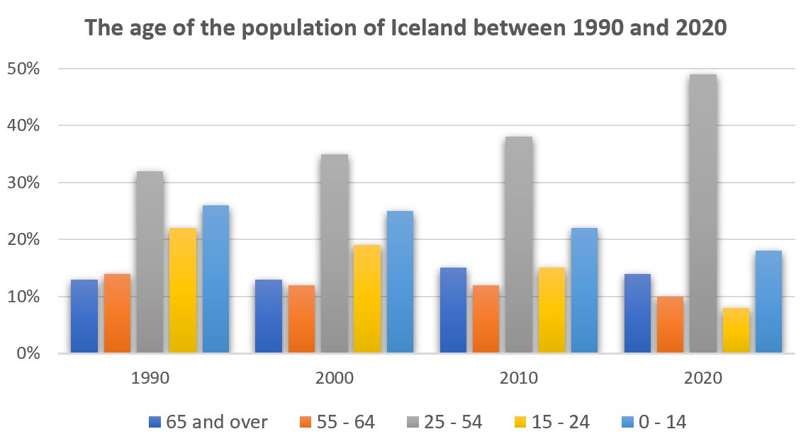
Bar Chart Sample
The graph gives information about the age of the population of Iceland between 1990 and 2020. Summarise the information by selecting and reporting the main features, and make comparisons where relevant.
Pie Chart Sample
To compare two pie charts in an IELTS Writing Task 1, this sample answer demonstrates how to effectively organize the report, along with key language and sentence structures that can help achieve a high band score.
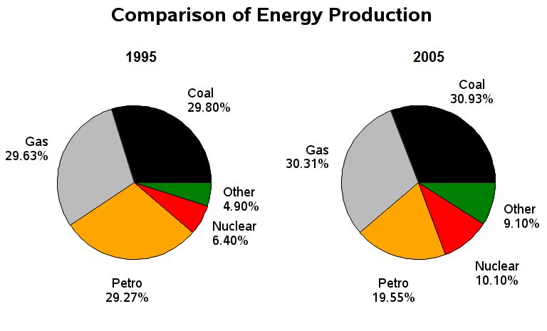
Comparison of Energy Sources in France: 1995 vs. 2005
The two pie charts compare the percentage share of five energy sources—coal, gas, nuclear, petrol, and other sources—in France during the years 1995 and 2005.
Overall, coal and gas contributed to more than half of the total energy production in both years, while the smallest share came from other energy sources. Production from coal and gas increased slightly, whereas nuclear and other sources almost doubled. Petrol was the only energy source that saw a decline over the period.
In 1995, coal accounted for 29.80% of energy production, rising marginally to 30.9% by 2005. Similarly, gas production increased by about 1%, from 29.63% in 1995 to 30.1% in 2005. Nuclear energy saw a notable rise from 6.40% in 1995 to 10.10% in 2005, while other energy sources increased from 4.90% to 9.10%. Conversely, petrol's contribution dropped significantly from 29.27% in 1995 to just 19.55% in 2005.
Line Graph Sample
Birth and death rates in New Zealand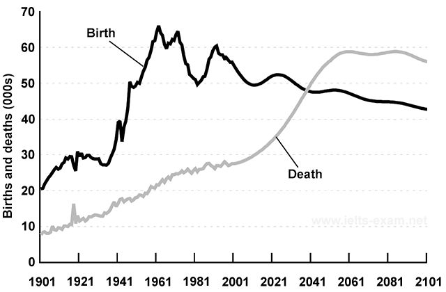
The graph gives information about changes in the birth and death rates in New Zealand between 1901 and 2101. Summarise the information by selecting and reporting the main features, and make comparisons where relevant.
Process Diagram Sample
The diagram below shows the process by which bricks are manufactured for the building industry.
Summarise the information by selecting and reporting the main features, and make comparisons where relevant. Write at least 150 words.
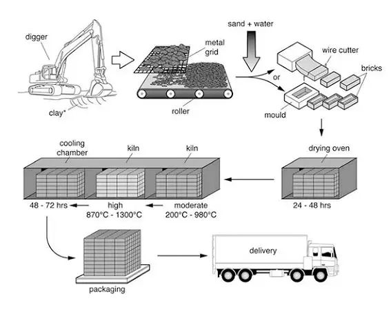
The diagram illustrates the stages involved in the production of bricks for the building industry. Overall, the process consists of seven steps, beginning with digging the clay and ending with the delivery of finished bricks. Initially, clay is extracted using a large digger and then passed through a roller machine for filtering. Afterward, the clay is mixed with sand and water. In the next stage, the mixture is either molded or cut with a wire cutter to form the raw bricks, which are then dried in an oven for 24 to 48 hours. Following this, the dried bricks are fired in a kiln at both moderate and high temperatures, reaching up to 1300 degrees Celsius, before being placed in a cooling chamber for 48 to 72 hours. Once cooled, the bricks are packed and delivered, completing the moderately complex process of brick manufacturing.
Map Diagram Labelling Sample
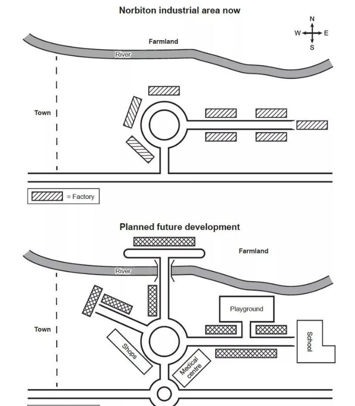
The maps illustrate an industrial area in Norbiton in the present day compared with plans for future development of the site.
Summarize the information by selecting and reporting the main features, and make comparisons where relevant. Write at least 150 words.
The maps illustrate an industrial zone in Norbiton town currently and a proposed redevelopment scheme for the whole area.
Overall, Norbiton will become more residential, so the factories will be demolished to make way for new housing. Moreover, two new roads and a mini roundabout will be built along with new shops, a medical center, and a school.
Looking at the current layout, a main road runs from east to west with a roundabout in the middle, which is surrounded by factories that extend to the east. In the north, farmland is situated over the river. There are currently no houses or other facilities in this industrial zone.
Regarding redevelopment, from the central roundabout a new road will extend north and a bridge is to be constructed over the river with plans for new housing on the farmland. In addition, a road extending northwest with housing and shops is earmarked for construction. Next to the new mini roundabout, a medical center will be built. To the east, a school and playground are proposed with extra residential facilities. Notably, no factories are expected to remain in the plans.
Combination Charts Sample
The graph below shows CO2 emissions for different forms of transport in the European Union. The Pie Chart shows the percentage of European Union funds being spent on different forms of transport. Summarize the information by selecting and reporting the main features, and make comparisons where relevant. Write at least 150 words.
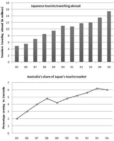
The bar chart outlines how many Japanese travelled overseas between 1985 and 1995 while the line graph delineates the percentages of these tourists who visited Australia in particular between 1985 and 1994. Overall, the number of Japanese who made overseas travels soared and this is also true for the Australian visiting travelers from Japan. As can be seen from the illustration, around 5 million Japanese citizens travelled to different countries in 1985 which kept on increasing each year except in 1991. From approximately 7 million tourists in 1987, it went as high as 12 million in just 6 years.
Finally, in 1995, around 15 million Japanese toured foreign countries which was three times higher than that of a decade earlier. The line graph shows that 2% of Japanese tourists reached Australia in 1985 and with a steady increase this figure went as high as roughly 5% in 1988. The next year the ratio slightly dipped but went higher each year in the subsequent years. Australia received more than 6% of Japanese travellers in 1993, the highest, which stood at exactly 6% in 1994.
Some More IELTS General Writing Task 1 Samples
Here are some latest Writing Task 1 topics with sample answers for IELTS General Training:
Formal Letter Semi Formal Letter Informal LetterTop Tips for Success in IELTS Writing Task 1
To excel in IELTS Academic Writing Task 1 and IELTS General Training Writing Task 1, candidates should adhere to essential preparation tips. Below are some key strategies for structuring your responses for IELTS Writing Task 1.
- Understand the Task Requirements: Carefully read the instructions to identify the main features and key trends presented in the visual data.
- Plan Your Response: Spend a few minutes organizing your thoughts before you start writing. This will help you create a well-structured response.
- Use a Variety of Vocabulary: Showcase your vocabulary range by avoiding repetition and using synonyms to describe the data accurately.
- Focus on Key Details:Emphasize the most significant information while avoiding unnecessary details that do not enhance the overall understanding of the data.
- Practice Time Management:Allocate sufficient time for each task, aiming to complete Writing Task 1 within the suggested 20 minutes.
- Utilize Synonyms: Instead of copying words from the prompt, paraphrase using your own vocabulary.
- Include Units of Measurement: Use measurement units such as millions, percentages, tons, and dollars. This shows attention to detail and helps highlight contrasts or similarities in data trends for logical comparisons.
- Incorporate Linking Words: Use connectors like "while," "in addition," and "on the other hand" to connect your ideas and enhance cohesion.
- Stick to Clear Language: Avoid overly complex expressions. Keep your writing clear and concise.
Common Mistakes to Avoid in IELTS Writing Task
While analyzing visuals or framing the letter might seem straightforward, Task 1 can trip you up if you're not careful. Here are some key mistakes to avoid:
- Misinterpreting Data/Prompts: Make sure to thoroughly comprehend the information presented in the visual data before you begin describing it.
- Ignoring Task Instructions: Be attentive to the specific requirements of each task and ensure that you remain focused on the assigned topic.
- Overlooking Grammar and Spelling: Carefully proofread your response to catch and correct any grammatical errors or spelling mistakes.
- Lack of Coherence and Cohesion: Ensure that your response is logically structured and cohesive, with clear connections between sentences and paragraphs.
The IELTS Writing Task 1 can appear daunting, but with commitment and effective strategies, you can master it. Keep in mind that regular practice, a focus on continuous improvement, and a solid understanding of the test format are essential for reaching your target band score. If you need assistance, don’t hesitate to connect with our IELTS experts or participate in our IELTS webinars. So, take a deep breath, grab your pen, and begin your journey towards mastering IELTS writing!